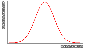
In economics there is a theory called “The Paradox of Choice”. It states that increasing the number of choices will improve the user experience, but only ultil a certain point. After that point the added choices will not only be indifferent to the user, but they might also become counterproductive.
A simple example: market researches found that individuals in a supermarket are 10 times more likely to make a purchase if they have to choose among six rather than among 20 flavors of jam.
Now, what do jam flavors have to do with your blog you might ask? Your blog, just like the supermarket shelf, presents many choices for the visitor. Every link, in fact, is a choice. When someone visits your blog he will need to choose among reading the home page, clicking on a single category, clicking on the advertising, contacting you and so on. If that is the case you need to make sure that you are not overwhelming your visitor with too many choices (links).
This approach applies to the whole blog design. If you place too many fields on the sidebar like “Latest Posts”, “Latests Comments”, “Top commentators”, “Blogroll”, Polls, Badges, Meta Data and so on the reader will probably get confused and avoid the sidebar. Similarly if you fill the bottom of your posts with “Related Entries”, advertising, subscription buttons, affiliate links and other extra information the user will just get lost and skip those sections altogether.
Do not get me wrong here, having those items on your blog are important, but not all of them bundled together otherwise they will lose the usefulness. Limit the set of choices for the reader and he will be much more likely to perform an action (i.e. click on a link).


Good point Daniel. Also, I think having extra links like latest comments and other things on the sidebar can be important, but if they ruin the experience of the reader, then they are bad. Of course, if you blog only for yourself without caring much about others or the audience reach, then you can do whatever you please on your blog.
We have to experiment. I would like to stress this a lot! Experimenting is everything. We cannot just find something interesting and use it. For example, I am still debating over the use of many links in my sidebar [for my main site], even though it seems to be something that promotes a community. I would love to have less links, and I think I am going to clean it up more. Some sites can get away with no extra links other than the sidebar, and some sites can get away with a lot of links on the side.
Choices are good; however, like some of your previous tips mention, we have to market our presentation in ways that users can understand and appreciate. We also have to see if the choices we are presenting to people are necessary or optional. For example, presenting links to other sections of a site can be necessary, but showing “latest comments” is optional. That optional component, the “latest comments” area in a sidebar, can both help people get involved more in a blog by showing them other commentors who are also commenting, and at the same time, that “latest comments” area will confuse a lot of readers who already know that clicking a post will show them comments for that post and seeing that extra information “only” allows them to participate more, but does not really give a strong incentive as to why they should participate. Does that make sense? I hope I am not too confusing.
In the sidebar, I can put a couple of hundred links to outside places and to areas on my own site, and they can all be relevant to the user. However, simply adding a choice on top of other choices, when there are other ways to find out those exact choices by going through different places on a site, probably confuses people. Think about redundancy also; having the latest comments on every page while viewing pages with comments that show those same latest comments also confuses people more. It somehow adds more links pointing to the same page, the way we talked about in your other post regarding removing links from single titles. Of course, we can have dynamic sidebars, where going into specific single posts will not show certain elements of a sidebar, or even the entire sidebar all togther.
Off-topic: there will be hundred different views on the same concept out there. That does not mean that what Daniel described was wrong/inferior compared to Hick’s Law, Donald. 🙂 The link you mentioned is interesting and we can incorporate it into our sites somehow too, as it seems to be more numberized; thanks for sharing. 🙂
Mike, you are right, there are some blogs that manage to get away with huge amounts of ads, but I guess they first established themselves as THE authority for a certain niche, and then readers would tolerate that due to the good content.
There are some blogs I read on a regular basis like Engadget that that have 3 columns (some have more) and the main content of the site is only about 500pixels wide. The rest of their blog is filled with ads and random crap but I almost never see it. My eye is so trained as a reader now that it just goes to the left of their blog to read the comments.
Some people are running 3, 4 and even 5 column WordPress blogs and its just too much fluff content. I’m actually thinking of removing the “Recent Commenter” off the right sidebar of my blog, which is sparse in design to start with. The reason is, I question how much value it really brings to the site and more importantly, what it adds to the users experience.